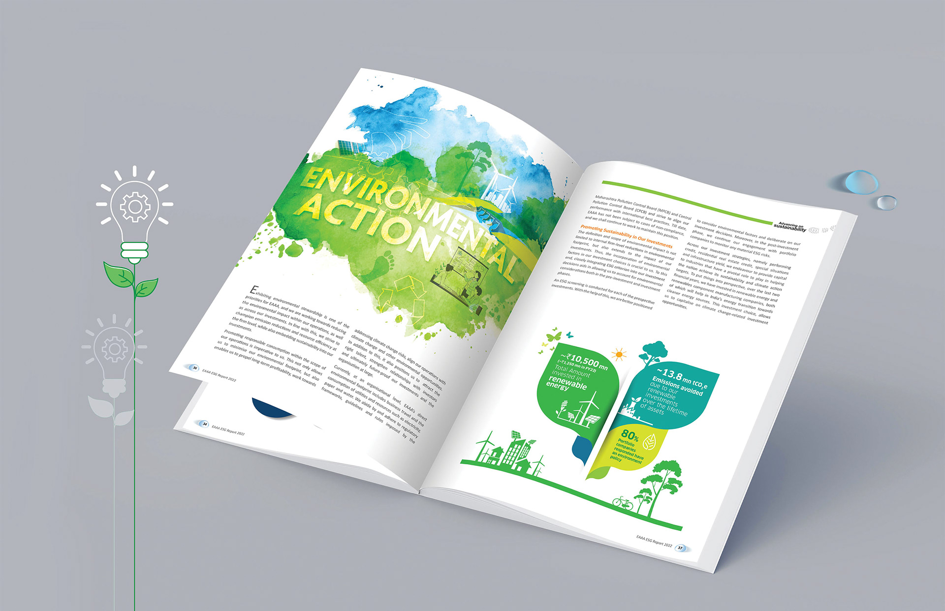
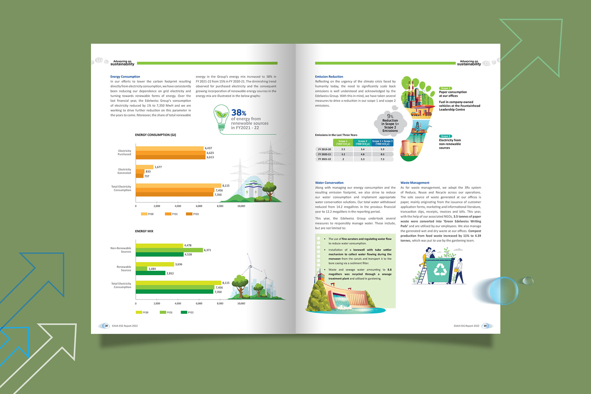
Employing a watercolour aesthetic lends the report an organic, fluid feel, reminiscent of nature’s own canvas. The touch of line art and illustrations reinforces the fusion of the company’s core business activities with its environmental and social responsibilities.
The thematic separators don’t just demarcate sections; they create visual breathing spaces, moments of reflection between the hard facts, allowing the reader to digest and appreciate the magnitude of the company’s efforts.
The colour palette, thoughtfully chosen to resonate with ecological themes, enhances the overall visual experience. Muted greens, earthy browns, and serene blues echo the very environment the company seeks to protect and sustain.


