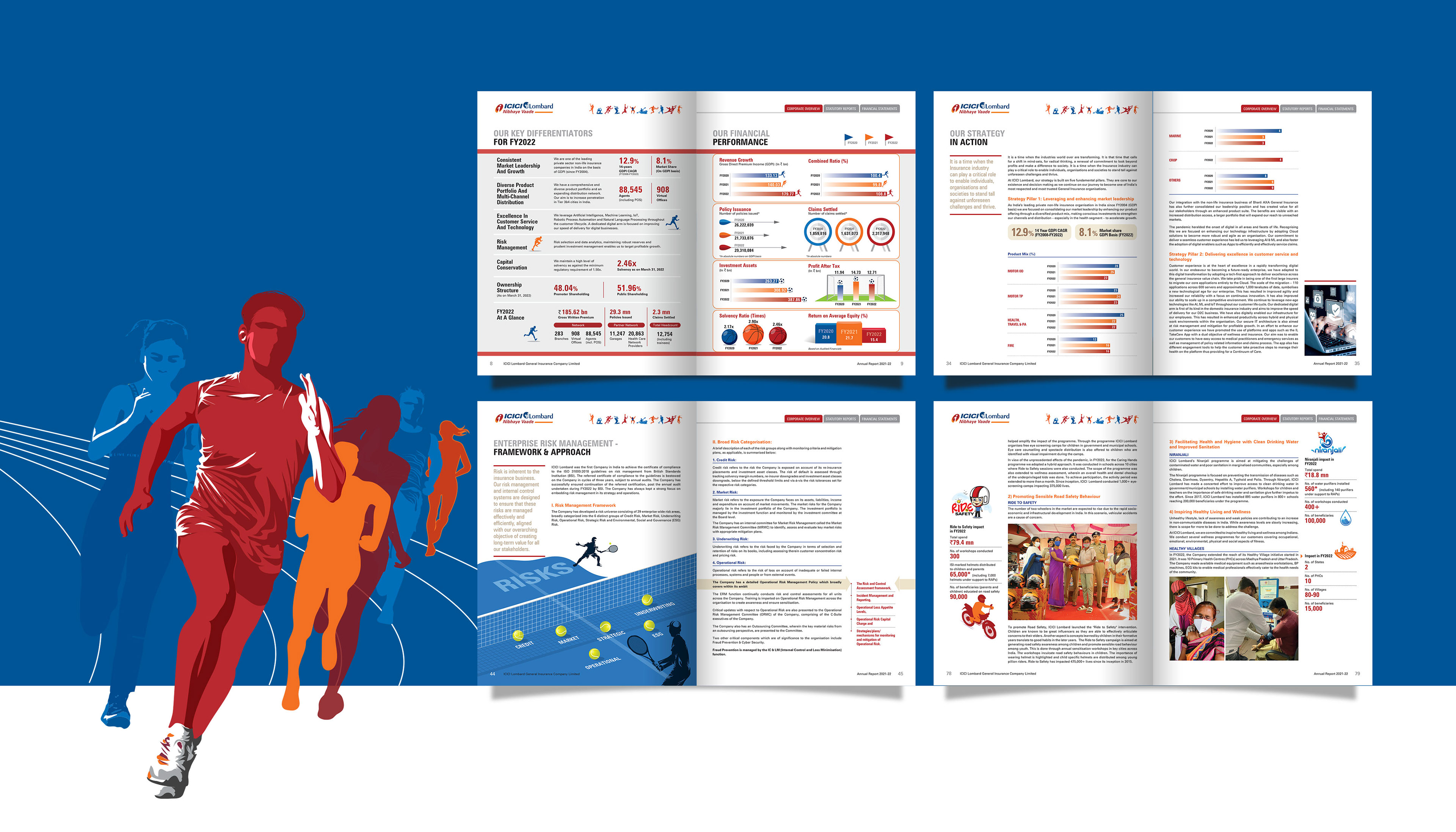
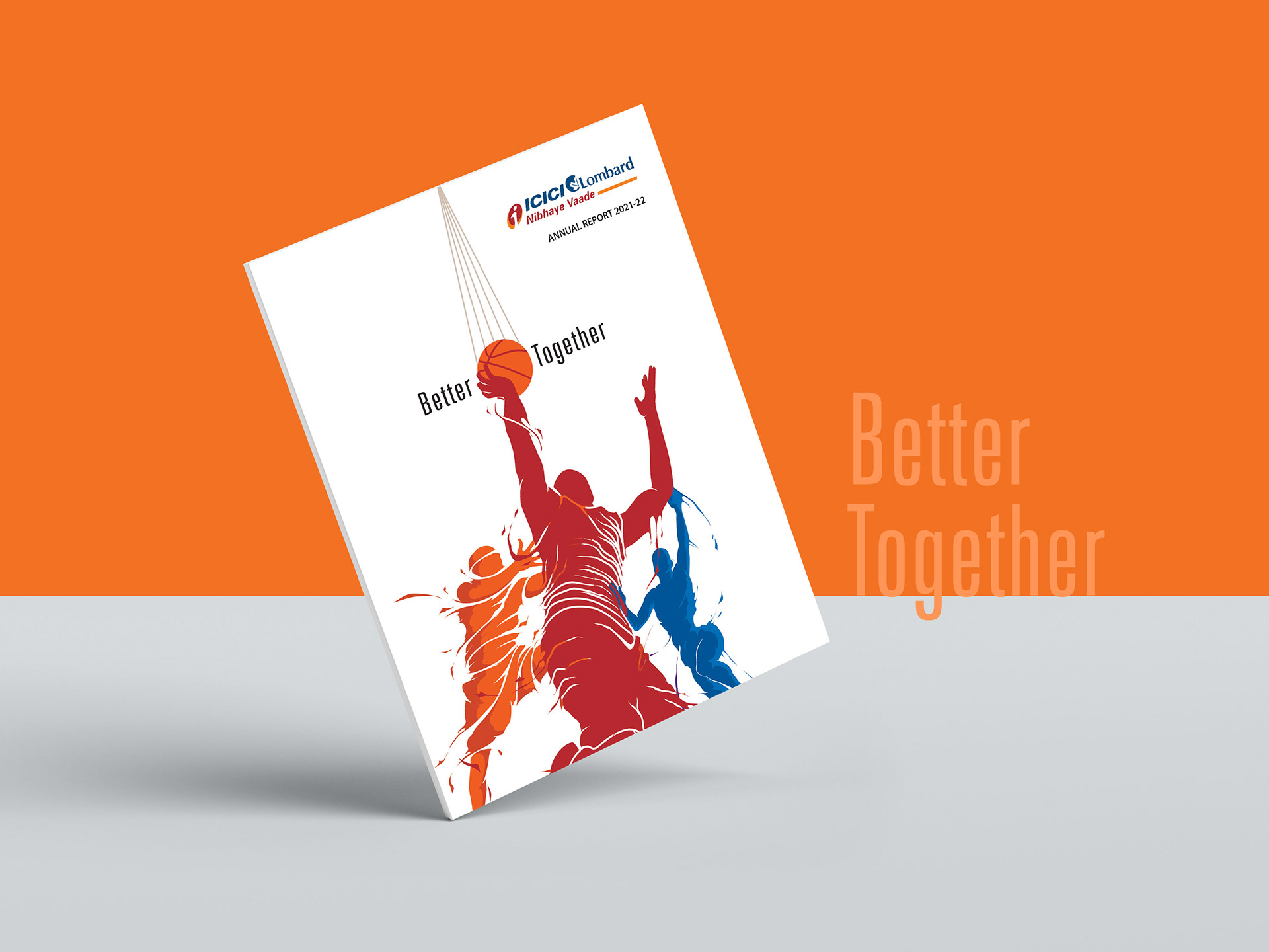
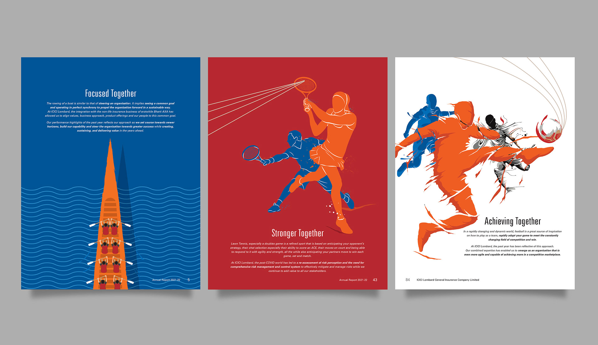
The essence of this theme emanated from the powerful idea of collaboration, symbiosis, and shared strength - much like the recent integration. To visually represent this harmony and unified power, we settled on the metaphor of team sports. Team sports inherently exude the values of collective strength, strategy, and the idea that the sum of the parts is always greater than the individual entities.
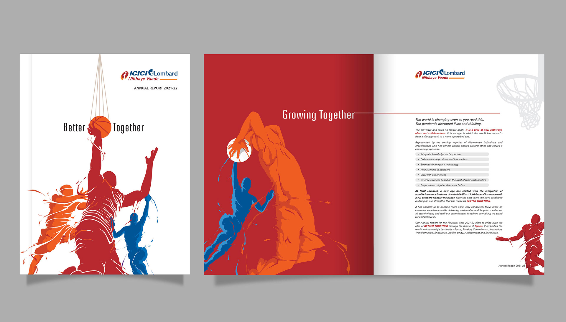
This theme was consistently reflected throughout the report, especially in the separator pages aptly positioned before introducing different sectors. These pages not only served as visual pauses but also seamlessly integrated the thematic representation with the business data.
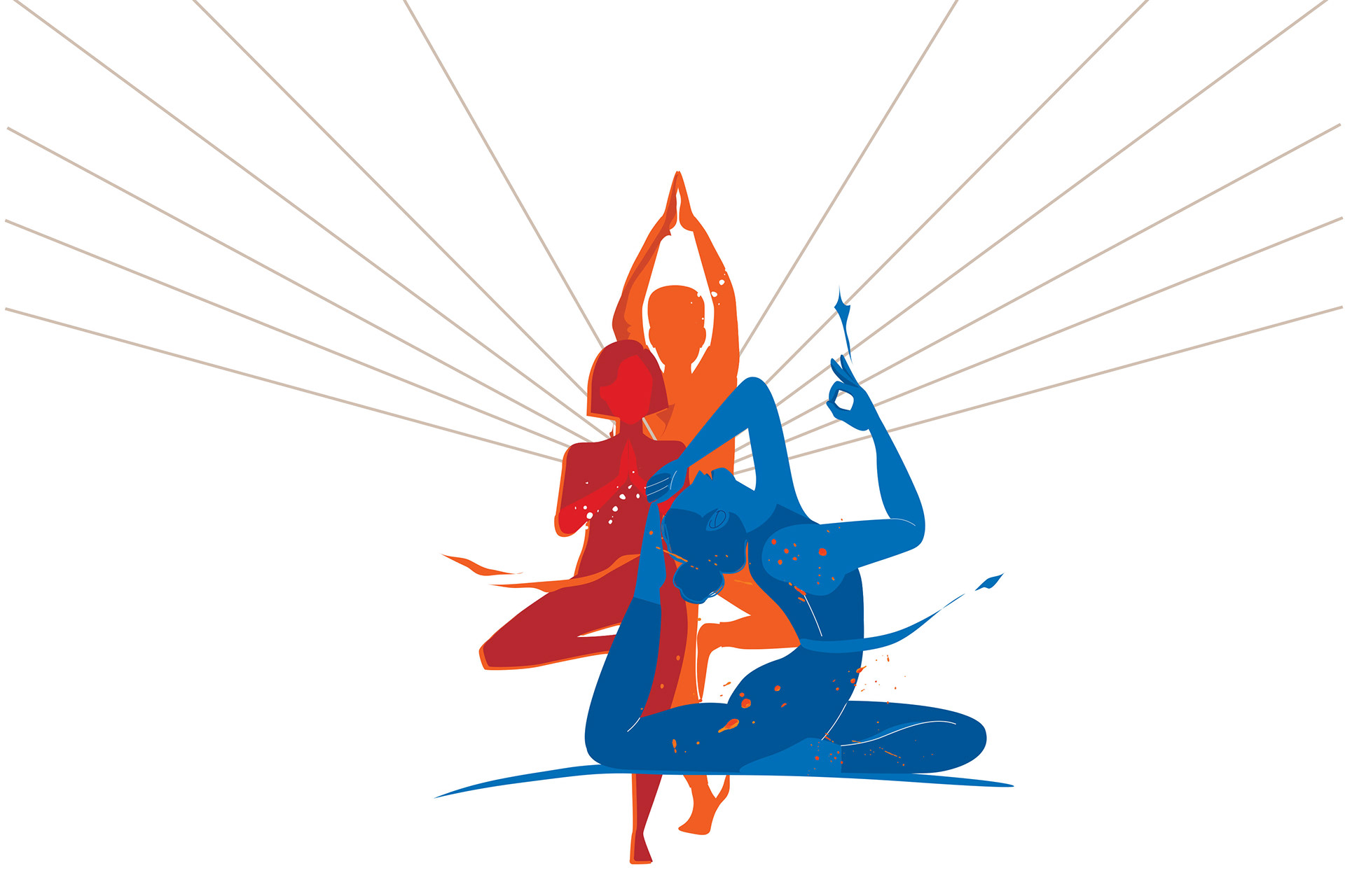
For this report, I capitalized on ICICI’s brand colors: the vibrant orange, rich maroon, and deep blue. These colors were employed boldly, drawing a direct parallel to the energy of the sports visuals and resonating with the combined vigor of the merged entities.
THE DESIGN PAGES